The Cellar
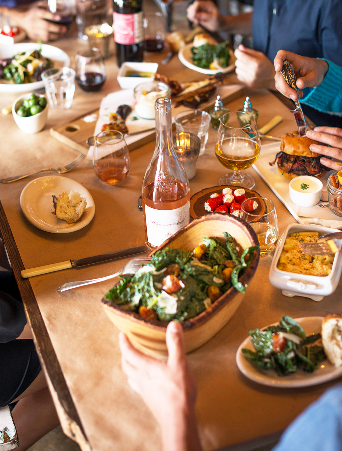
art direction
package design
package design
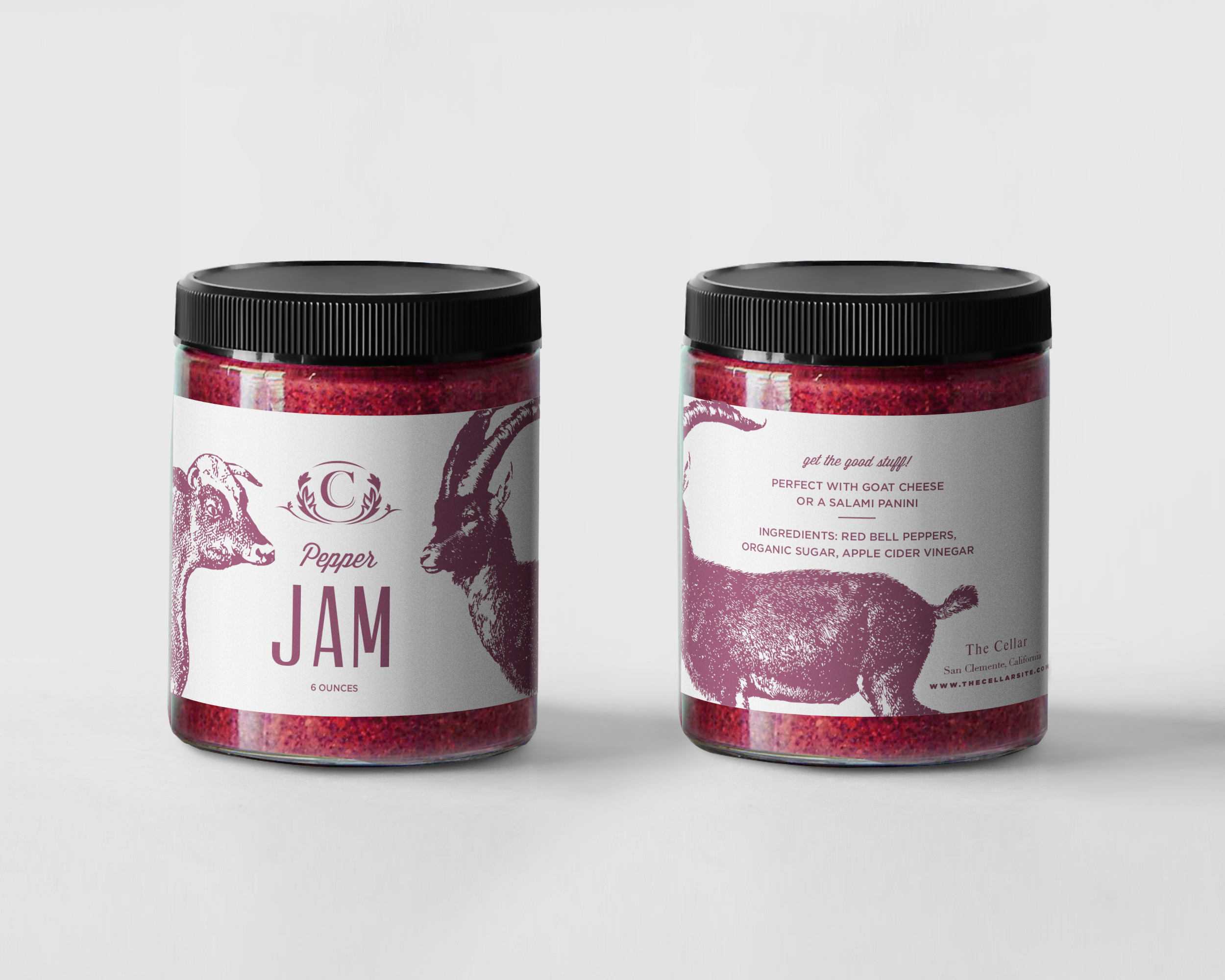
package design
IMG_0474
Screen-Shot-2015-04-16-at-12.41.24-PM
campain images
website homepage
Screen-Shot-2014-03-25-at-3.38.32-PM
Screen-Shot-2014-03-25-at-3.36.53-PM
Screen-Shot-2014-03-25-at-3.37.55-PM
About This Project
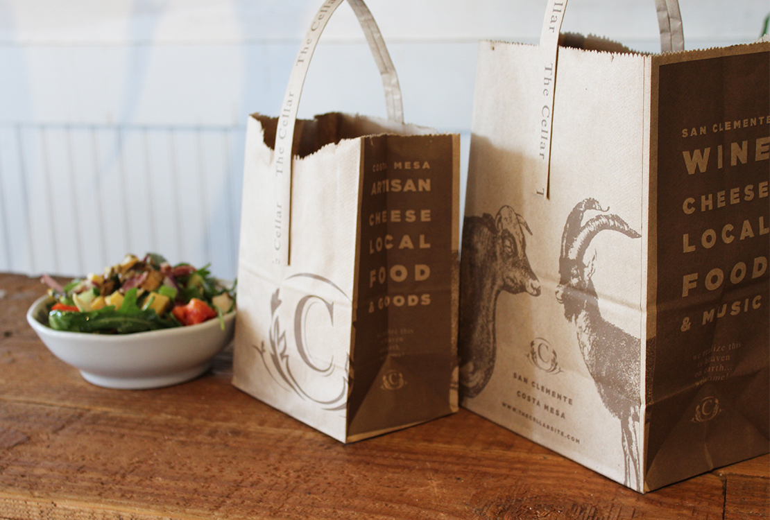
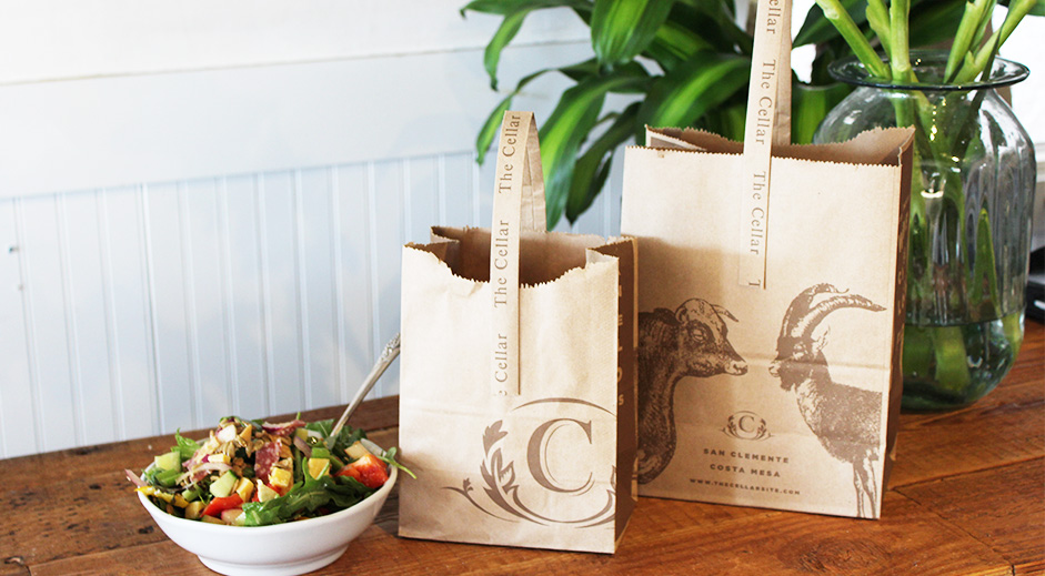
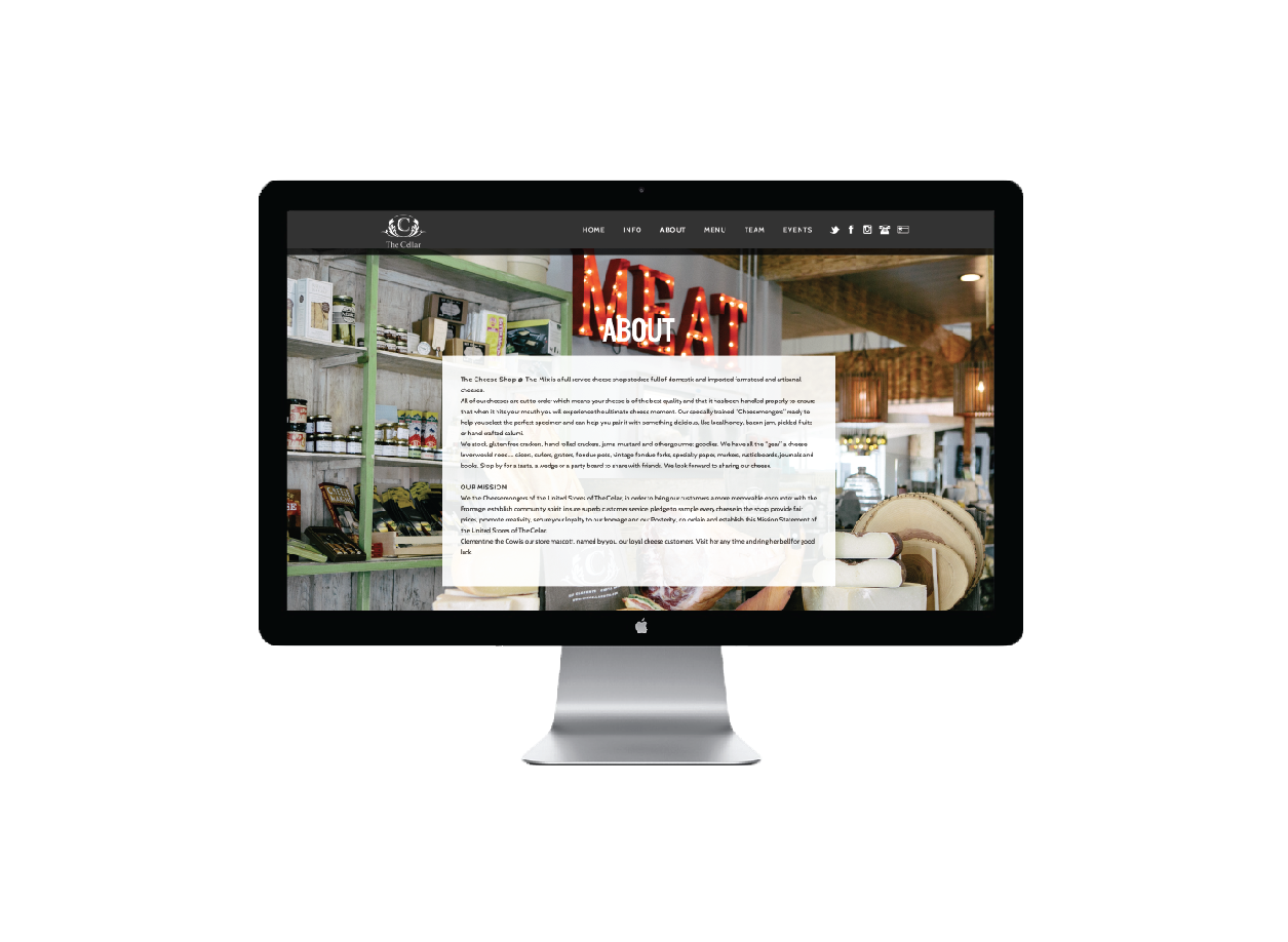
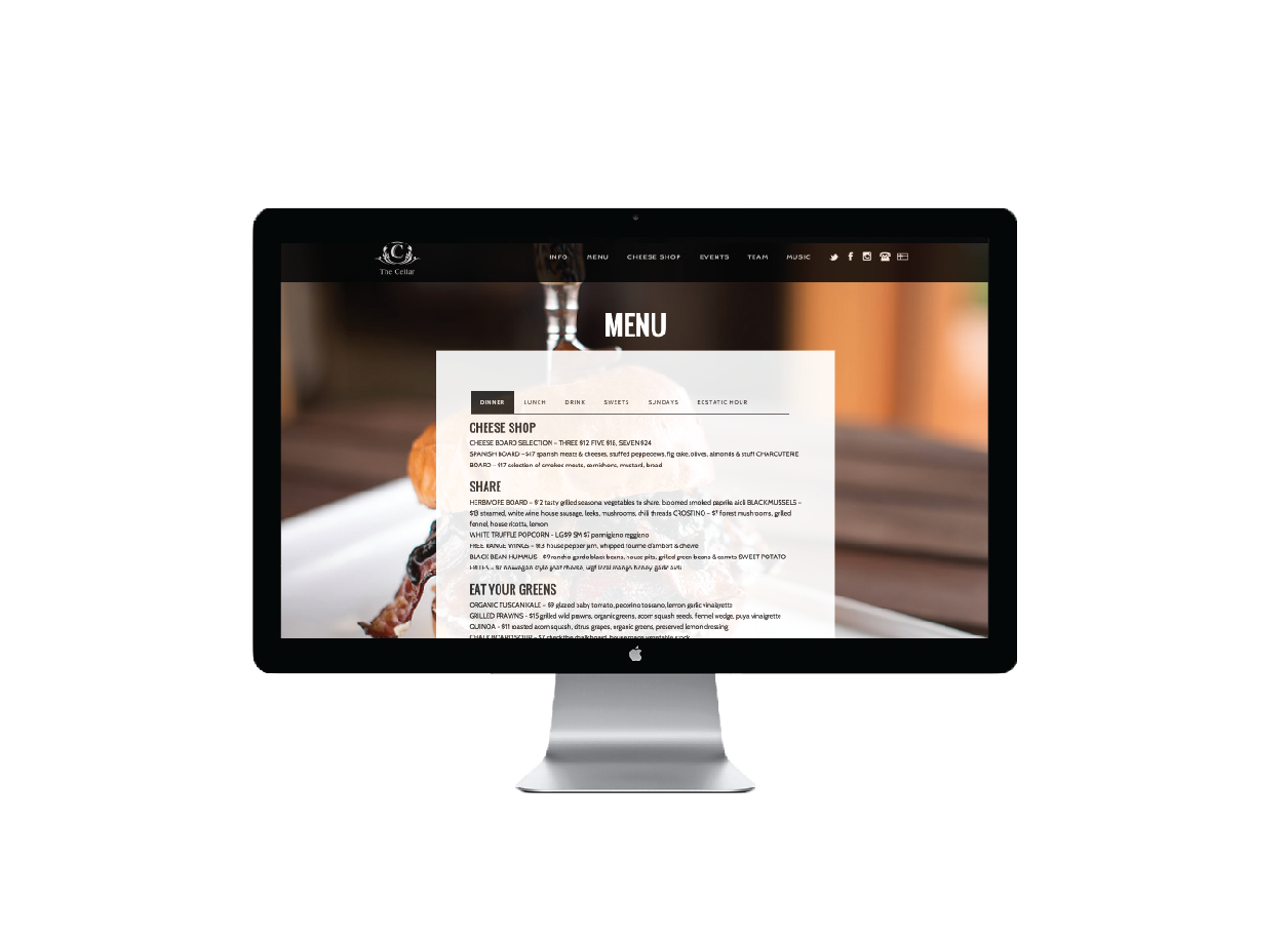
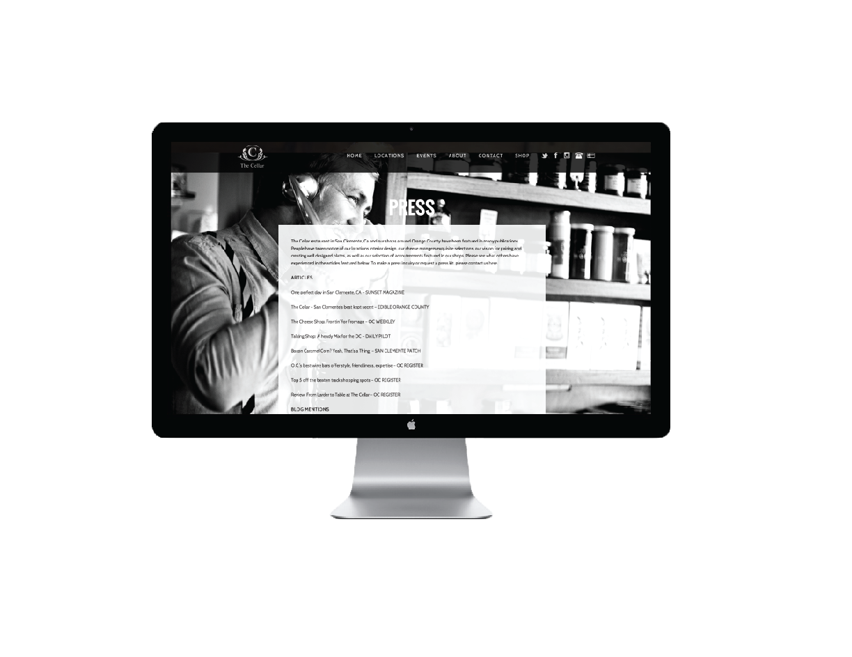
The Cellar Restaurant group website and multiple branding projects are all featured on this page here. The Cellar came to me with the goal to unify their brand across all platforms, print and digital to get a consistent look and feel for their restaurant. The goal with their printed materials was to streamline everything and make the menus, brochures, tags, labels, bags and other materials easy to read while still maintaining the personality of the flagship San Clemente location.
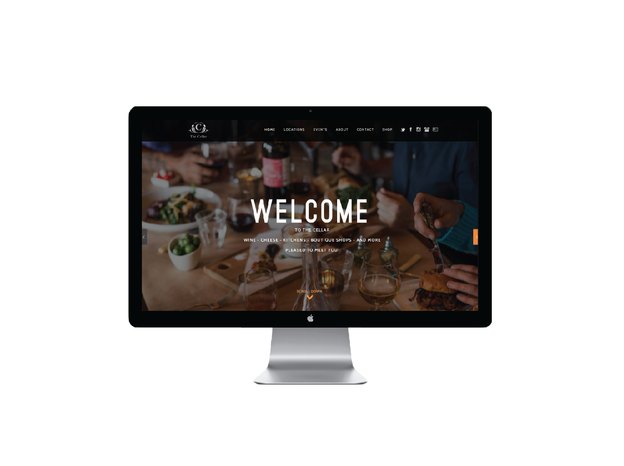
In re-designing their website, I worked with the owners to create elevated content, art directing photography and direction for how we wanted the user to experience The Cellar online. The previous website had a great personality but lacked clear direction and experience for the user so we curated our goals and created a site with the main objectives to show firstly the ambiance of the location, then the food then the practical ways to get to the kitchen and store.
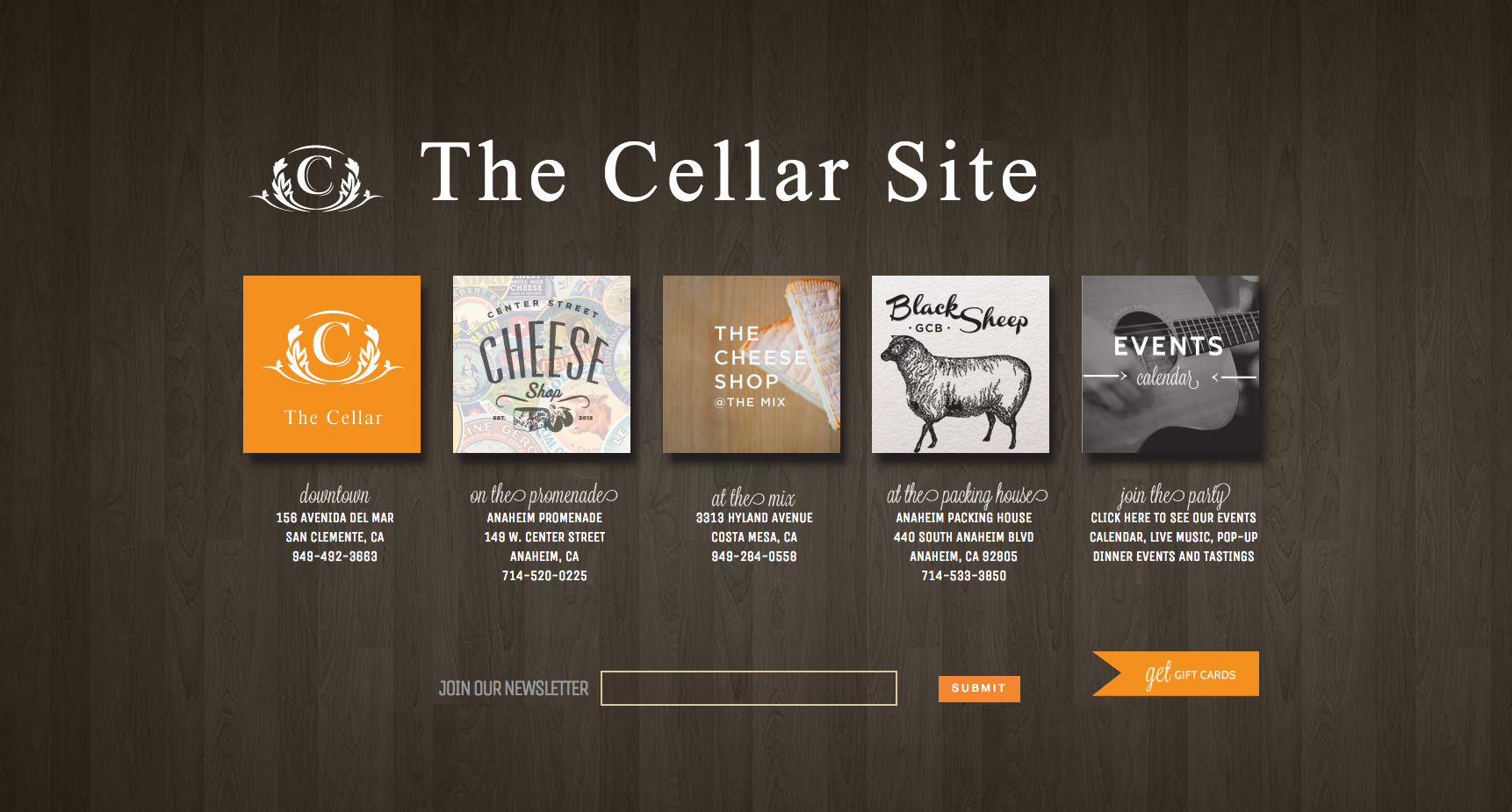
Their locations continued to grow and the site was able to grow with their brand. www.thecellarsite.com is now a landing place for 4 other venues.
Date
20 November
